Python interactive dashboard. This post will explain the process of creating an interactive dashboard using Python. For analysis and visualization requirements, I’ve utilized a startup layoff percentage dataset obtained from Kaggle. If you want to get the dataset, you can find it here. In this post, I only focus on explaining the Python code we’ll be working with. However, for a comprehensive exploration of the insights gained from data visualization, please check out the following post:
Startup Layoff Percentage: Unveiling Trends and Insights
Import the required Python libraries and packages
Here is the codes :
pip install pandas plotly dashpip install plotly pandaspip install pywafflepip install pandas matplotlib seaborn scikit-learnimport pandas as pd
import numpy as np
import matplotlib.pyplot as plt
import seaborn as sns
import pandas as pd
import matplotlib.pyplot as plt
import seaborn as sns
from pywaffle import Waffle
Import Dataset and Data Cleansing
df = pd.read_csv('layoffs_data.csv')
print(df)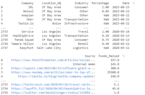
Delete unnecessary columns :
columns_to_delete = ['List_of_Employees_Laid_Off', 'Laid_Off_Count', 'Source']
layoff_data = df.drop(columns_to_delete, axis=1)
Delete blank rows, rename and add new columns :
layoff_data = layoff_data.dropna(
axis=0,
how='any',
subset=None,
inplace=False
)

layoff_data['Layoff_percentage'] = (layoff_data['Percentage'] * 100)
print(layoff_data)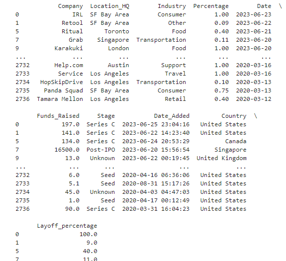
Scatter Plot : Layoff Percentage vs Funding Value
features = layoff_data[['Layoff_percentage', 'Funds_Raised']]
kmeans = KMeans(n_clusters=3)
Define the grouping levels based on the Total_Fund_Raised
layoff_data['Funding_Group'] = pd.cut(layoff_data['Funds_Raised'], bins=5, labels=['Low', 'Low-Medium', 'Medium', 'Medium-High', 'High'])Create the scatter plot with color-coded grouping
sns.scatterplot(x='Funds_Raised', y='Layoff_percentage', hue='Funding_Group', data=layoff_data, palette='rocket')# Customize the plotplt.title('Scatter Plot: Layoff Percentage vs. Total Fund Raised')
plt.xlabel('Total Fund Raised (in $ Mio)')
plt.ylabel('Layoff Percentage')
plt.legend(title='Funding Value Group')
plt.grid(True)# Show the plot
plt.show()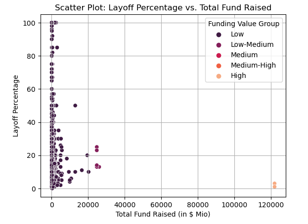
Infographic Style Visualization : Layoff Percentage based on Funding Stage
# Set some In_percentage values to NaN
layoff_data['Layoff_percentage'].iloc[100:200] = np.nan
# Define the grouping levels based on the Total_Fund_Raised
layoff_data['Funding_Group'] = pd.cut(layoff_data['Funds_Raised'], bins=5, labels=['Low', 'Low-Medium', 'Medium', 'Medium-High', 'High'])
# Drop rows with NaN values (optional, depending on your use case)
layoff_data.dropna(subset=['Layoff_percentage'], inplace=True)
# Calculate the percentage of layoff values for each funding group
layoff_percentage_by_group = layoff_data.groupby('Funding_Group')['Layoff_percentage'].mean()
# Calculate the total fund raised values for each funding group
total_fund_raised_by_group = layoff_data.groupby('Funding_Group')['Funds_Raised'].sum()
# Scale the percentage values and calculate the scaled layoff percentages
layoff_percentage_scaled = (layoff_percentage_by_group / layoff_percentage_by_group.sum()) * 100
# Replace NaN values with zero in layoff_percentage_scaled
layoff_percentage_scaled = layoff_percentage_scaled.fillna(0)
# Calculate the number of icons based on the scaled percentages
total_icons = 100 # Total number of icons you want to display
layoff_icons_scaled_by_group = (layoff_percentage_scaled / 100) * total_icons
# Create the infographic-style visualization using Waffle chart
fig = plt.figure(
FigureClass=Waffle,
rows=5, # Number of rows for the waffle chart
columns=20, # Number of columns for the waffle chart
values=layoff_icons_scaled_by_group, # Use the number of icons
labels=[f'{group}\n{round(value, 2)}%' for group, value in zip(layoff_percentage_by_group.index, layoff_percentage_scaled)],
figsize=(12, 6), # Size of the plot
colors=['#1f77b4', '#ff7f0e', '#2ca02c', '#d62728', '#9467bd'], # Color palette for the waffle chart
legend={'loc': 'upper left', 'bbox_to_anchor': (1, 1)}, # Legend location and position
icons='user', # Icon used for the waffle chart
icon_legend=True, # Show the icon legend
icon_size=18, # Size of the icons
)
# Customize the plot
plt.title('Percentage of Layoff in Different Funding Value Groups')
plt.tight_layout()
# Show the plot
plt.show()
Interactive Dashboard Visualization 1 :
Layoff Percentage vs Funding Value
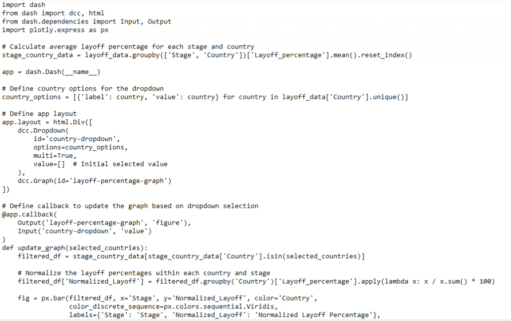
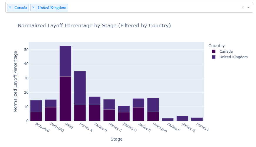
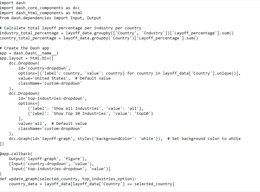
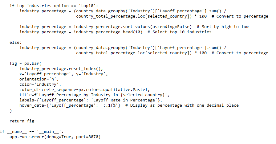
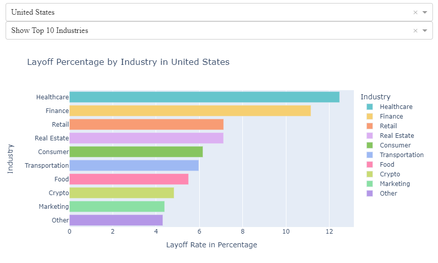
Interactive Dashboard Visualization 2 : Layoff Percentage based on Industry (Top 10 Industry per Country)
Combine two dashboard to deployed via PythonAnywhere
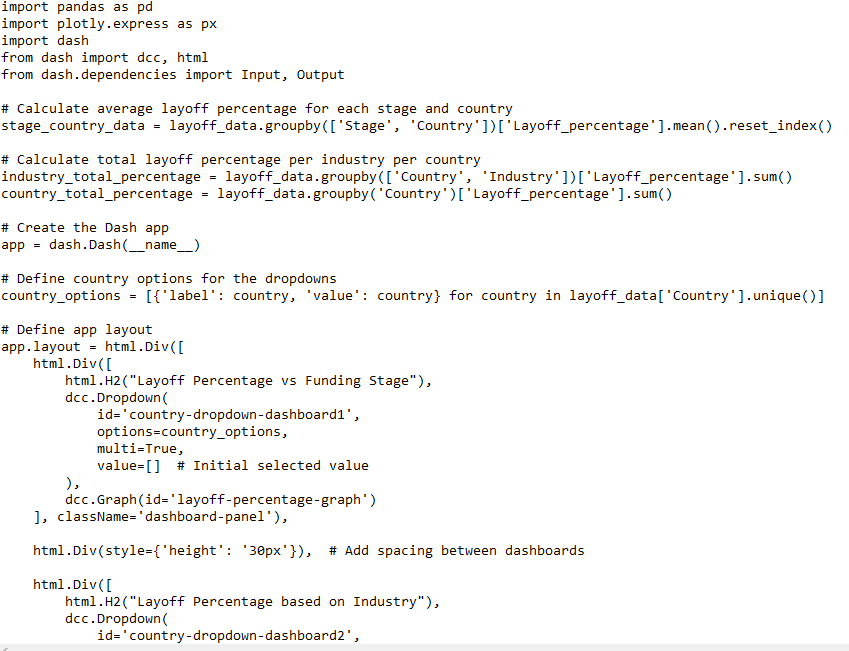
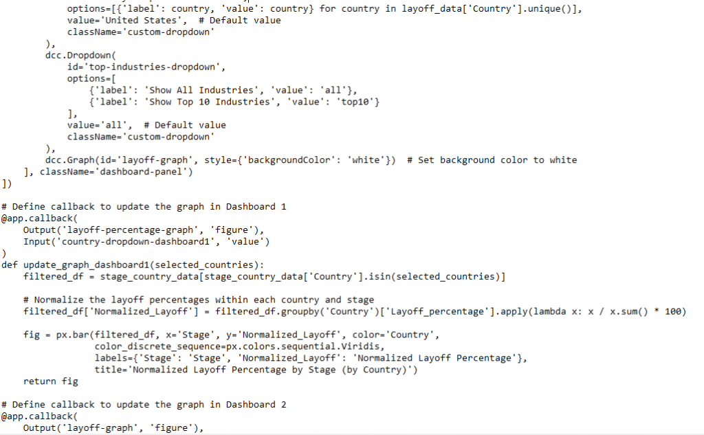
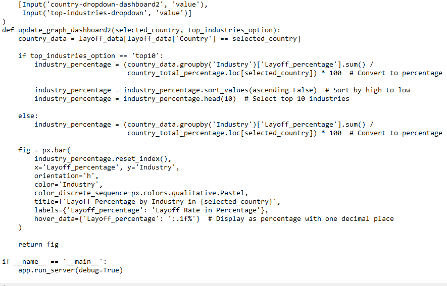
If you’re interested in making your interactive dashboard available to others, you have the option to deploy it using PythonAnywhere for free. However, it’s important to note that the free subscription of PythonAnywhere allows you to deploy the interactive dashboard as a single website link. In this case, I’ll be merging the two separate dashboards into a single dashboard featuring two interactive visualization layouts. Here are the relevant codes for achieving this.
And here is the interactive dashboard in real time:
I trust that this blog post has been valuable in enhancing your understanding of Python coding within the realm of data analysis. In my upcoming post, I will write about a comprehensive step-by-step process for deploying the interactive dashboard using Python Anywhere. Looking forward to sharing that with you. Until then, take care!
If you be interested in collaboration related to data analytics and business strategy consultation, don’t hesitate to reach out via email. Your support is greatly appreciated – consider fueling my efforts by buying me a coffee here.

